top of page

Subscribe to the blog

Join my email list and never miss a blogpost.

Also get access to specials deals exclusive to my subscribers.

Thanks for subscribing!

The Blog

  • Writer: Andy Walker
    Andy Walker
  • Mar 8, 2024
  • 2 min read

(and how to make sure yours don’t!)

What is the number 1 priority for a good painting? Is it to do with colour? Or subject matter, or the way the picture is painted? I used to think that the number one consideration was tonal value and if I got that right, then I’d have a great painting. (Actually that is still true, but it has now been relegated by me to the No. 2 position.)

Now, all these things are good, and all are necessary. But recently I have become totally convinced that Composition is the king of all. Without a good composition from the very start, the painting is already doomed to mediocrity.

Why do I say this? Because the composition provides the bones on which we build the body. If the composition is weak, then the underlying structure of the painting is weak, and then, no matter what we do, we will never get a successful painting. We can fiddle and twiddle and tweak the painting as much as we like, but it will never resolve the underlying problem.

Some examples of powerful compositions

Night Sleeper

Portrait of Henriette

Teel’s Island

Above are three paintings by the famous American painter Andrew Wyeth (1917-2009). For me he was a master of strong composition. Almost every painting he made shows a powerful design which undergirds the picture. It is the first thing you see. His paintings are strong and powerful and have an immediate impact on the viewer. And this is all down to the strength of the composition. His colours are muted, his tonal value range is often limited, but yet the paintings draw you in by the design.

Wyeth often based his designs on vertical and horizontal lines which give his pictures solidity, and then he introduced a few diagonals to bring in variety. His pictures may seem static, but the diagonals bring a sense of movement or light.

A similar technique is used by Ian Roberts, a contemporary artist, YouTuber and writer. Here below are three of his paintings.

Ian Roberts

Ian Roberts

Again you can see the strong horizontal and vertical lines used in the compositions, making them stable and solid.

Finally, here are three of my own paintings which were sort of inspired by this idea of the strong horizontal/vertical composition.

Asleep in the Saddle

White Heat

Tithe Barn

I hope you have found this helpful. I certainly plan out my composition much more before beginning a painting, and this has helped to create a few more successes. I now truly believe that a strong composition can really help with creating a strong painting. Give it a go!

Happy composing!

  • Writer: Andy Walker
    Andy Walker
  • Mar 1, 2024
  • 2 min read

(How to breath new life into failed paintings)

Everyone who paints knows about failed paintings. We all have them. And that’s quite normal. I read a statistic somewhere that said that something like 95 to 99% of all paintings are considered failures. That’s only between one and five in every hundred that you paint, that you think is worthy of the grade, something you might frame or show to others.

As for the rest – well, they are a part of our learning journey. In truth no painting is a failure because each one teaches us something new. They are only failures inasmuch as we consider them to be not our best work.

So what can we do with our “failures”?

Nobody likes waste, and if you are painting in oils or acrylics, then help is at hand. You can rescue your failures. (This is a bit more tricky for the watercolourists amongst us but you can always paint on the reverse side of a failed painting, thus saving the paper).

Here’s what I did to re-use a failure. This saved me throwing the board away and made for an interesting experiment.

Original “failed” oil painting 20 x 30cm

This is my failed painting. I knew what i was aiming for but it didn’t quite hit the mark. Now I did fiddle away at it for quite some time, but it still wasn’t going anywhere, and so I decided to just consign it to history and paint over it with a completely new picture.

1

  1. The painting was quite dark and so I knocked it back with some thinned white oil paint. This obliterated most of the details and left me with an interesting underpainting, some of which was to show through the new painting. I left this to dry for a day.

2

2. I used ultramarine blue to block in the darks and shadows of the new painting. I tend to do this first to give the a structure to work on and to help me see if the “bones” of the painting are working. Now is the time to re-adjust, eliminate or move anything before it is too late.

3

3. I now tested some of my other main colours to check if they were okay and if they were the right tonal value before committing to painting too much in.

4

4. Now I blocked in more of the painting using thick juicy strokes of paint.

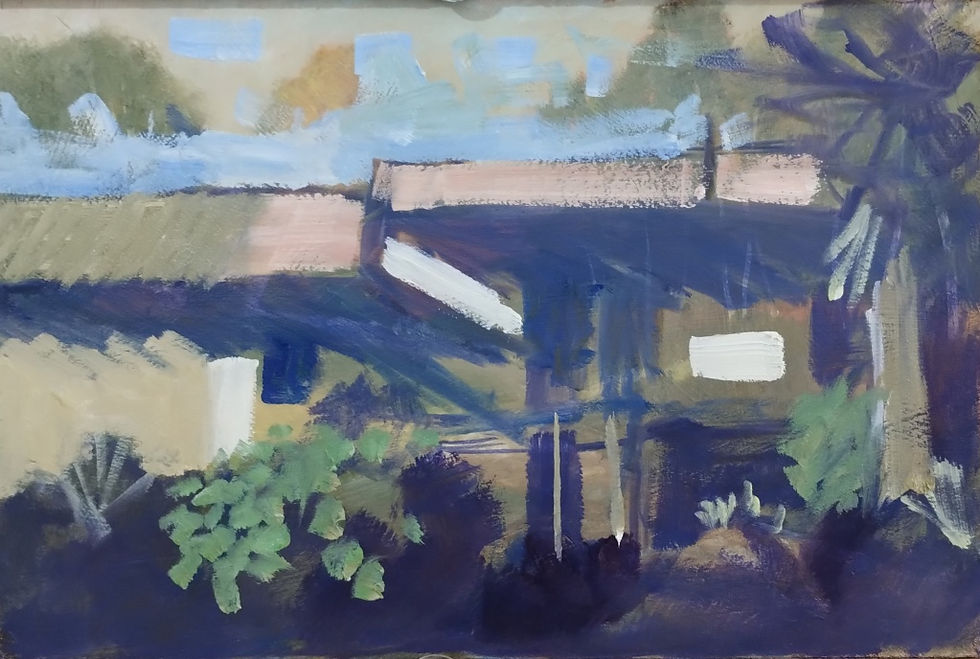
Cool Blue Afternoon – oil on board 20 x 30cm

The finished painting: board rescued and no waste. (This painting is available here) I think that’s a win-win!

.

  • Writer: Andy Walker
    Andy Walker
  • Feb 23, 2024
  • 2 min read

I suspect that you will have used a viewfinder of some kind or another to help you to choose your view and isolate your subject. Perhaps you have bought one or made your own by cutting a rectangular hole out of a piece of cardboard. But the other day I came across a natty and completely obvious use for the bit you normally throw away – the piece in the middle. Let me explain…

Here’s how to make one


Step 1. On a piece of cardboard or mountboard mark out a 17cm x 20cm rectangle. Then measure 4cm in from each edge and draw a rectangle which will be 9 x 12cm. Mark the thirds with short lines on all four sides of this small rectangle and then place a ruler across them and mark where they fall on the edge of the outside larger rectangle. Make sure your marks cross the line of the inner rectangle.


Step 2. Cut out the inner rectangle with a sharp knife. Then cut V shaped notches in the outer edge of the large rectangle where you marked the thirds. Don’t throw the inner rectangle away as you will have a use for that later


Step 3. Lightly stretch thin cord, string or cotton thread across from notch to notch, and Sellotape it to the back


Step 4. For added strength, also Sellotape the cord to the front. Your viewfinder is now ready for use. Just hold it up and look through the hole to find a view you want to paint – but make sure your focal point rests on one of the intersections.

Now for the magic bit!


Draw around the inner rectangle to mark out your picture plane in a sketchbook. This will have exactly the same format as your viewfinder. Put a mark where the thirds fall and then use the edge of the card as a ruler to draw in your thirds. These will help you draw your picture and put everything in the right place as you also look through your viewfinder. It’s as easy as that! Why didn’t I think of it?


This viewfinder is for a 9″ x 12″ (3 x 4) format but you can also make one for 8″ x 10″ (4 x 5) or any other common picture format. As ever please give this post a thumbs up if you found it helpful. Many thanks 🙂

Painting and sketching – ideas, inspiration and practical help to improve your art.

Follow

  • Instagram
  • Facebook
  • Youtube

©2035 by Daniel Tenant. Powered and secured by Wix

bottom of page